So I've downloaded the map, and have been flying around it for the past couple of minutes, and I can finally put together some comments.
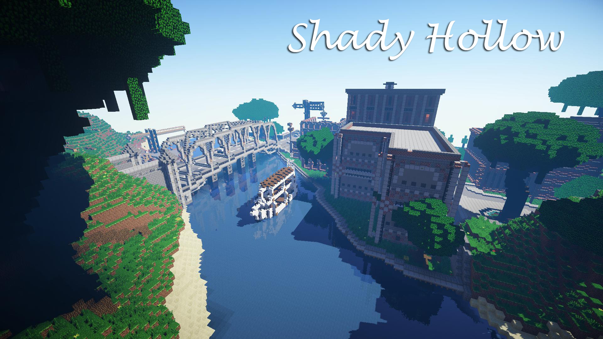
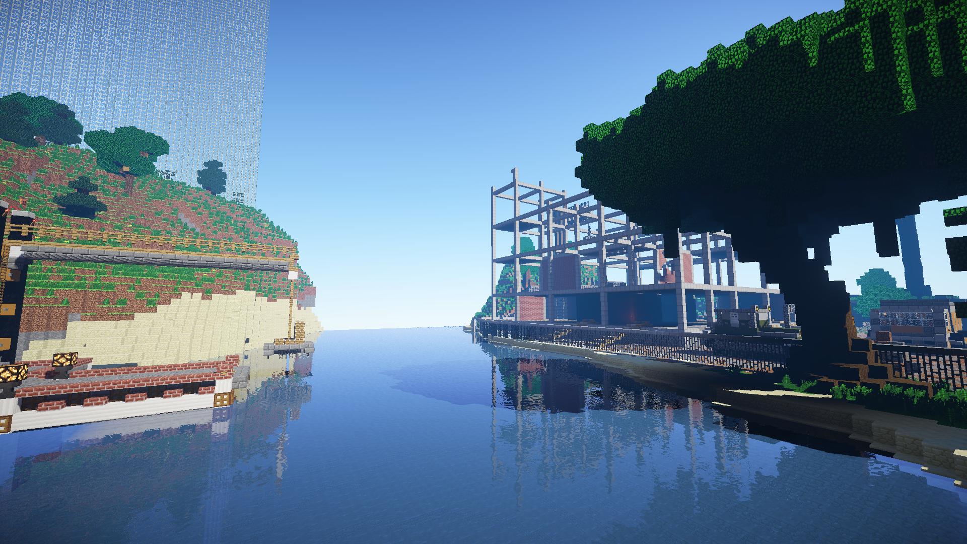
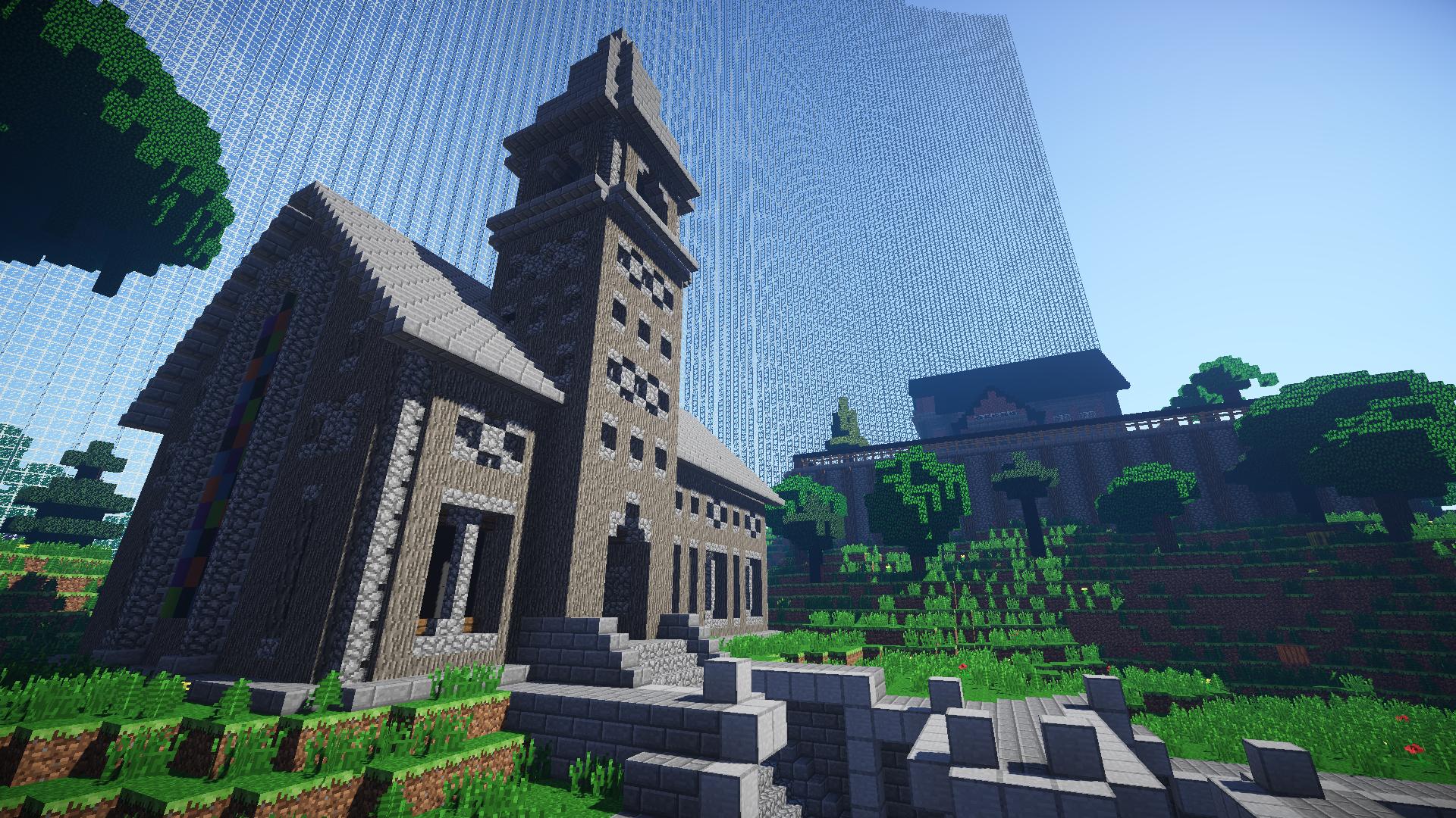
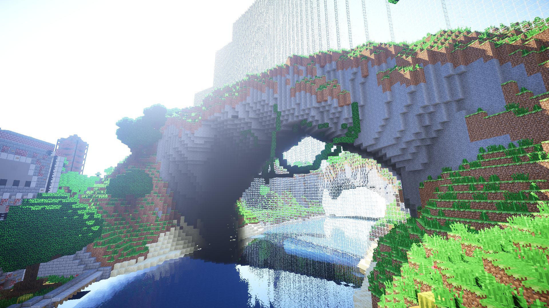
First off, the base of the map is the terraforming. Much like Zone 85 and Turbulence, the terraforming was really nice. Great blending, great structures and great layout. Really, the only problem I had with it is that it was a little too high for me, especially near the edge. What I mean by this, is that it’s kind of hard to just jump off one of the main street roads, and just make a beeline to one of those more rural-themed buildings. In fact, there were two buildings in which there was a designated path to go to either building, and it was impossible to get to those buildings any other way, confining the players to the path. I understand this is a design point, but I really think it goes against the openness of the map. I really enjoyed the depth overlay of the map, especially that sandstone next to the river. I think that was a perfect flair to set off the river from land. Though I enjoyed the depth overlay of the map, I didn’t really like the overlay of the land. There was so much grass on it, it made it seem very bland, and my eyes were just really bored of it. Plus the grass isn’t very good for PvP, especially fire. I really thought that a couple of stone or gravel blocks here and there could really benefit the overlay and make it more appealing. Some of the terraforming did seem out of place, specifically that arch. This is kind of bias since I honestly don’t think any arch is in place unless it’s a centerpoint of a map, such as Hungry Hills. Besides that, the terraforming was very nice. I also enjoyed that you kept the terrain going outside of the dome. Trees were very nice as well!
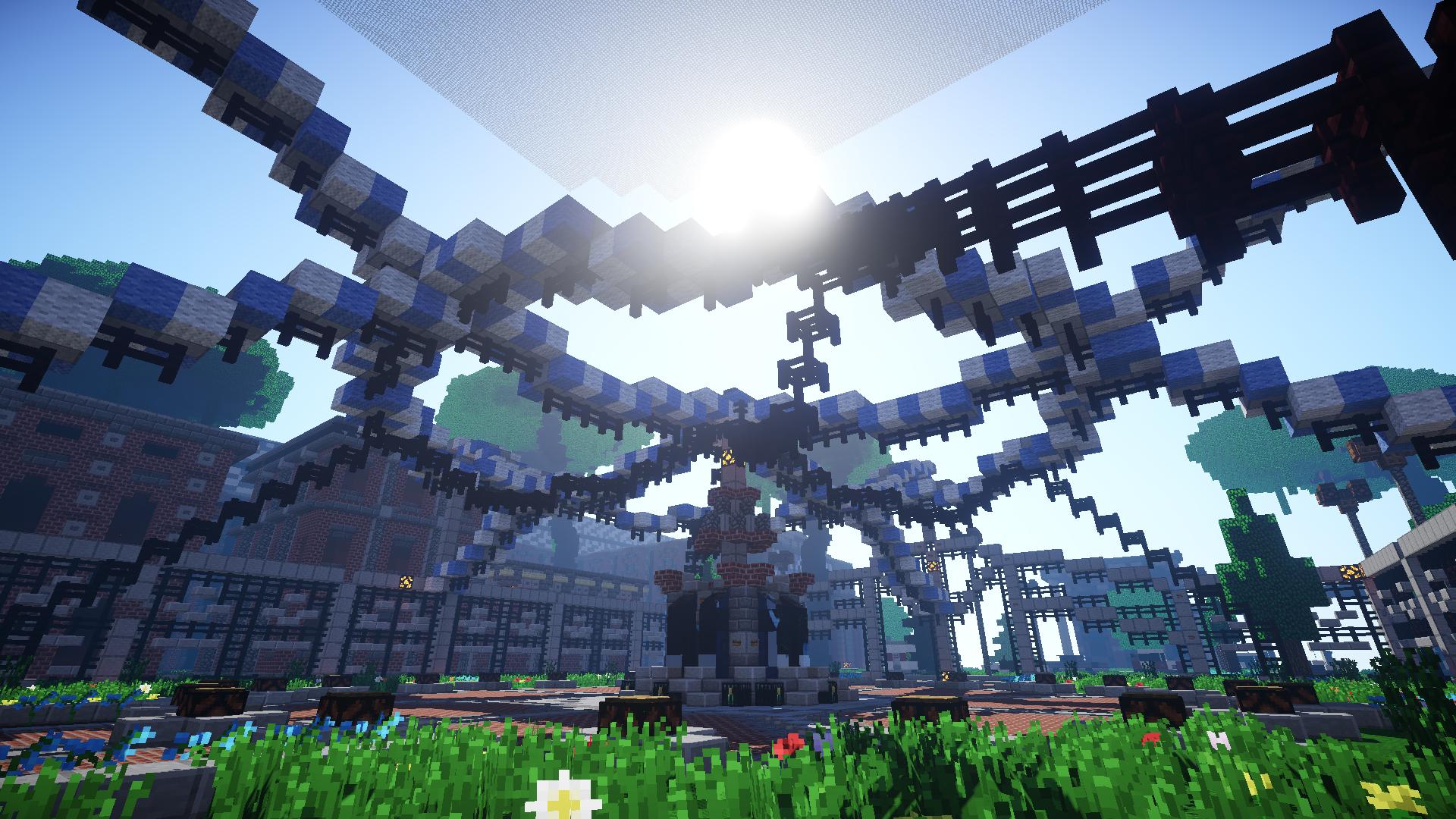
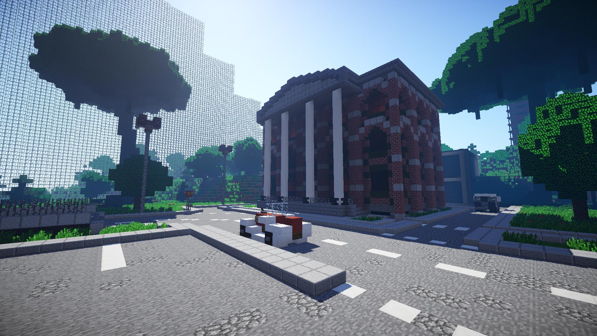
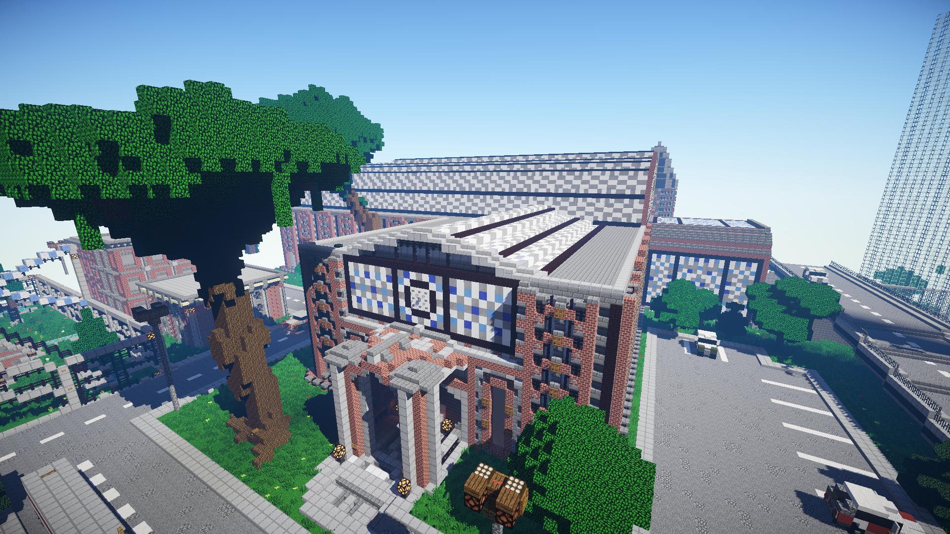
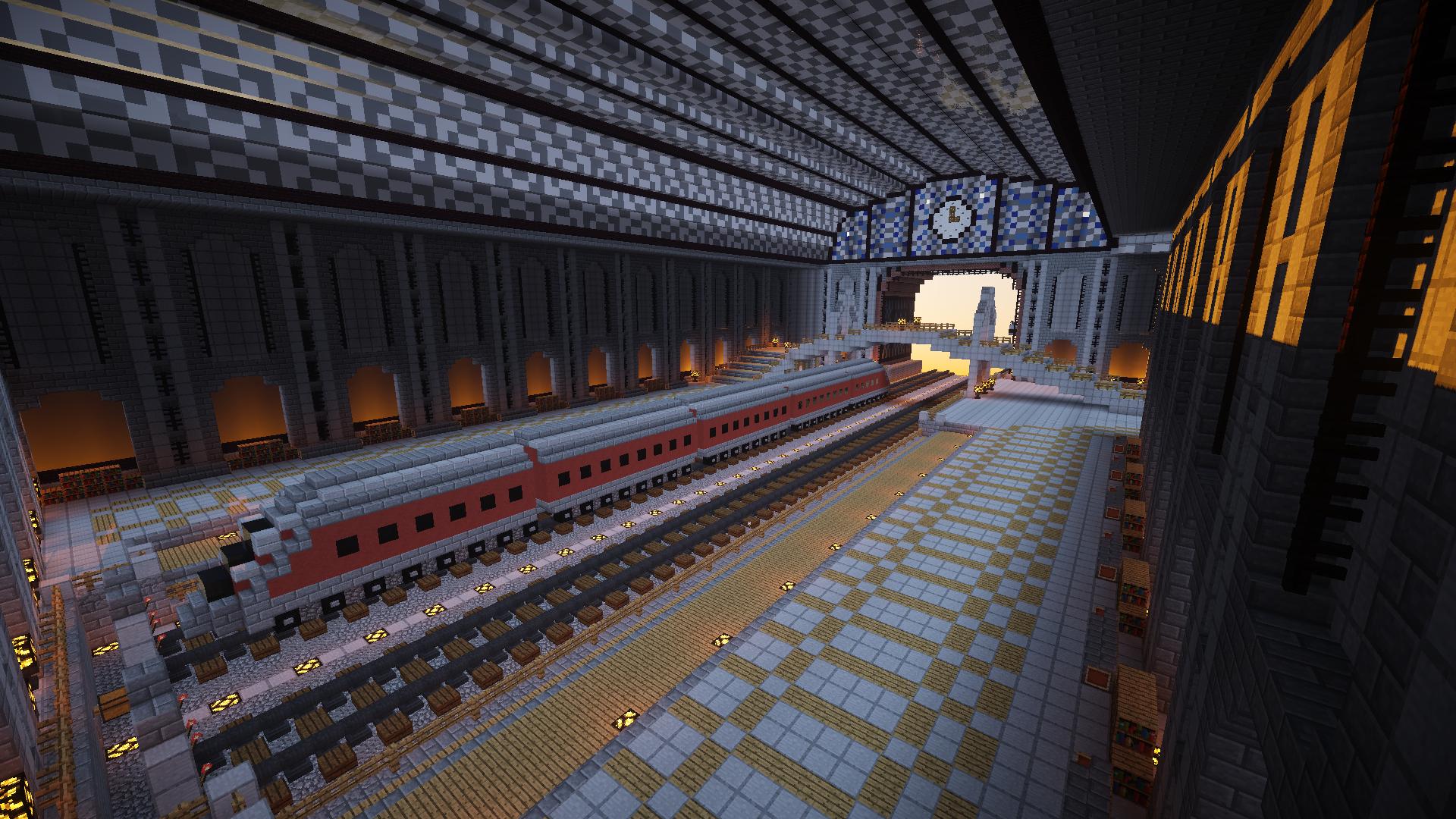
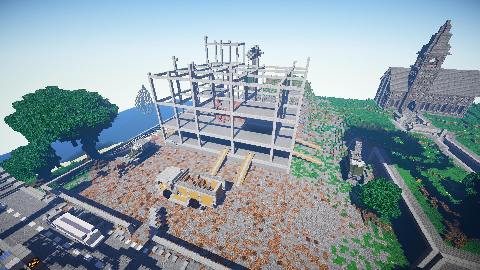
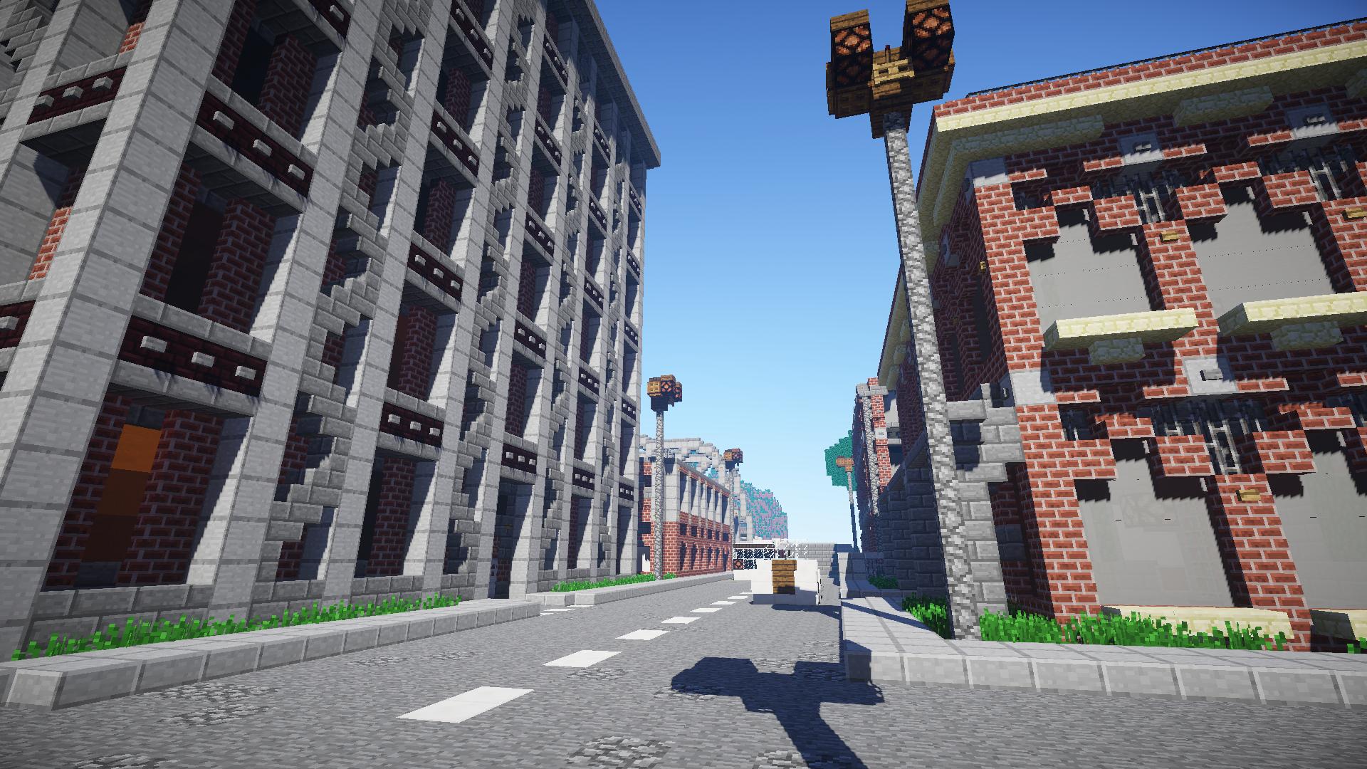
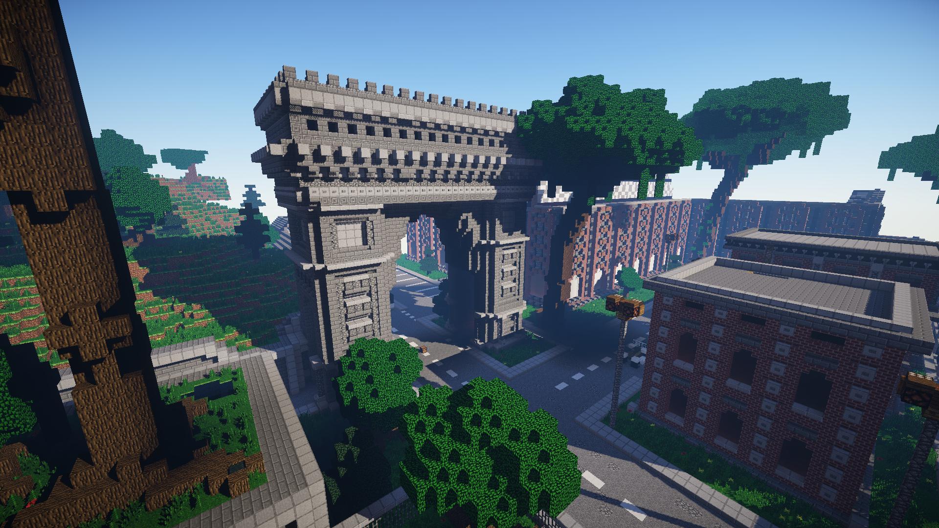
And now to the builds! I truly enjoyed the builds, they went well with the builds main theme, of a town. The builds used appropriate blocks, although some of the block palletes did seem strange to me, the team made it work out. The roads were detailed enough to make them seem interesting, but not too distracting, which is good. Only problem with the build is, was the lack of consistency of detailing, I felt like some builds, like the train station were very detailed, but some, such as the overhang next to the bank, were skipped over detailing. Also, I felt a lack of small buildings, such as houses. For a town, it’s essential to have those small houses where players can just pop in, grab a chest, and make their way out. Instead, It seemed like most of the good chests were in large buildings, forcing you to travel your way around them to grab a couple of chests. However, I did like those buildings and thought they were very nicely built. I really wish there was at least much more small buildings/houses in the grassy, outer part of the map. One thing I noticed, was a lack of interior designs on the big buildings, especially the train station. Also, the buildings that did have interiors, the interiors just felt very weak. A couple of fences here in there, a door, a sign, maybe a flower pot, and done. Felt very uncompleted. I really did like the in-construction building, though I wish there were more completed walls and details, as it felt very empty. Also, I would’ve put more chests there to make it more of a hotspot. Overall, I liked the builds, just not so much the interior.
Now to arguably the most important part, pvp! The pvp in this map, seems like it would be good. Only big complaints I have is corn, which has a lot of stairs and half slabs, making fire a problem, and it’s also very walled in, with only 2 major exits, and a couple of small exits, which one could possibly trip over. Besides that, I liked most of the maps pvp design, with the exception of the ridiculous amount of grass, which again, is bad for fire. Another thing that I think could greatly improve the map, is to ramp up the chest density. With a map so dense like this, I really think that it needs more chests, like Valleyside. I did see a lot of chests off roads, but I’m positive with more like those, the map could be much more fun to play.
Overall, I really liked this map. I know it’ll be a great addition to the good pvp maps of MCSG, and possibly join the ranks of Valleyside, SG4, and select others as a community favorite. Add some more chests, fix up those interiors, add some more houses, and remove some of that grass will make this map be a sparkling gem for sure! J
800+ word review, please don’t let my thoughts and suggestions go to waste
 SuperxAndrew cadbane4321