There are ??? players online now!
play.mcgamer.net
-
Our Minecraft servers are offline but we will keep this forum online for any community communication. Site permissions for posting could change at a later date but will remain online.
- Status
- Not open for further replies.
Parakoopa
Tribute
- Joined
- May 20, 2012
- Messages
- 40
- Reaction score
- 7
You do that manually? o_oThat being said, I will try to get you your donor status tonight.
NeatNit
Tribute
- Joined
- May 19, 2012
- Messages
- 45
- Reaction score
- 8
Well yeah, obviously... (for the contest winners that is)You do that manually? o_o
Parakoopa
Tribute
- Joined
- May 20, 2012
- Messages
- 40
- Reaction score
- 7
Oh I thought they were talking about normal donationsWell yeah, obviously... (for the contest winners that is)
CrowHH
Tribute
- Joined
- Apr 21, 2012
- Messages
- 58
- Reaction score
- 9
I made another version of my first design:

The numbers within the ( ) are the most __ In one round. So "Kills: 1000 (48)" Means that you've killed 1000 people, and you biggest kill streak is 48.
I also added a frame of diamond/gold/iron depending on what sponsor you are, I didn't bother uploading gold and iron (Damn you bad internet!) but I could if you want to.
The mcsg logo is now above the link.
And I changed the location of some text.
Edit: Forgot to edit the typo. It should be "Victories"
coolhascall
Spectator
- Joined
- May 26, 2012
- Messages
- 18
- Reaction score
- 0
I have another one that should look better. I changed text color for some of it, size (it is now 600 by 315 pixels), and background.
Normal player:
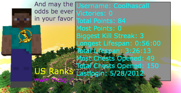
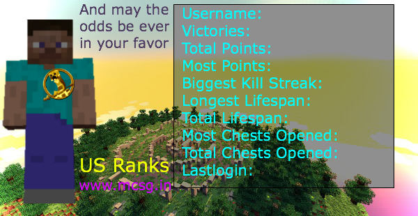
Iron player:
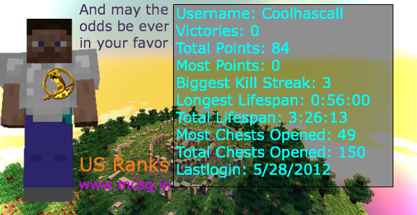
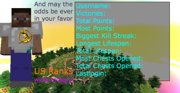
Gold player:
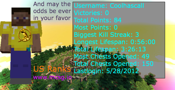
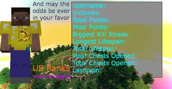
Diamond player:
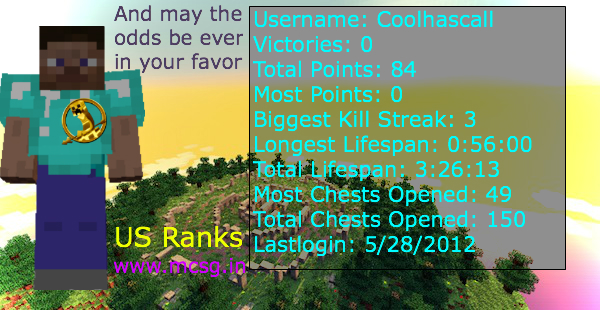
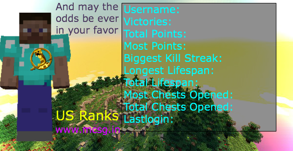
I am sort of frustrated on how large I started and how small I am making it, but if it needs to be smaller I can do that.
Changing texture of pin, will have better looking pin ones in a bit.
Normal player:
Iron player:
Gold player:
Diamond player:
I am sort of frustrated on how large I started and how small I am making it, but if it needs to be smaller I can do that.
Changing texture of pin, will have better looking pin ones in a bit.
coolhascall
Spectator
- Joined
- May 26, 2012
- Messages
- 18
- Reaction score
- 0
I am not as good other people are so this is very helpful and I did not know these would really matter, but now I do and this is very helpful thank you!Alright a couple of things. Let's start with the basics. It's really big. You are looking for something small and informative, not something that'll take up the whole screen with improperly used space. If you're going to display the design on a large scale, I'd suggest keeping the width/height ratio proportional to the different sizes provided. The background image is not very clear either and is hard to understand. Many players who already know the map would recognize the location, yet seeing as all you can pretty much see is grass and a couple of rocks, it's not doing its job, which I assume would be giving a passive, survival-like atmosphere. It is also not clear whether or not the character is actually standing on the grass or just hovering up there. The background image also contains a large variaty of colors, all mixed up with a fairly bold contrast. As a background image, you'd want it to be something "soft" to the eye, with a much lower color variation (preferably colors opposite to the text colors). In addition, Minecraft is known for its low-resolution textures - the grass nearby the "camera" is a bad choice, because it is not too eye candy if you know what I mean. This of course applies to the flowers and terrain, however the rocks are supposed to be cubical so they matter less here. The information tablet with all the variables is somewhat large and contains too much information. Note that the current signatures only give off around 4 variables, so you'd wana shorten it a whole lot. The color choice for the primary text I'd also recommend changing - it mixes up with the background image and is therefor unclear to the eye. I would recommend darkening the information tablet background even more and change the text color. Be sure that the borders of the text in relation to either the background image or anything else on the signature is clear. The same goes for the "And may the odds be ever in your favor" text. You chose to place it just in between the the player's head and the information tablet, and the distances between the edge of both sides of the text box to both the information tablet and the players' head are not equal and ruins the desired symmetry. I would have positioned this text (first off as a complete line of text, not 3) somewhere "after" everything else (everything else being the player and the information tablet which are the two primary subjects of the signature), and I'd give it a more passive look. The "Us Ranks" text and the "www.mcsg.in" text are well positioned, yet I'd recommend changing the colors, again, to something more united. This will create a very understandable color theme for the signature. If you look at it now, too many colors pop up at you (the strongest of them being the red of the information text, the light blue of the sky behind the grey-blue text, and the golden pin). Design-wise this is incorrect. You'd want a more united color composition - again, to allow a proper color theme, with at MAX a single twist, or exception. The player's position happens to be just infornt of these blocky rocks - and seeing the player is also very blocky, it is hard to tell between the two. This has multiple solutions, such as clearing out the background image behind the player, reducing contrast and color saturation of the background image or increasing it for the player - however the last two are kind of tricky. And lastly - the golden pin. It is very obviously just "pasted" onto the image, and it is hard to understand that it is supposedly carved or connected to the player in any kind of way. Its colors are way too dominant in relation to the rest of the signature, primarly due to its high inner contrast and saturation. Again, reducing these two scales would fix it, in addition to lowering the actual size of the pin, and perhaps giving it a nice color or pattern overlay. Generally, the whole image is sort of low quality, and lacks anti-aliasing which is seeing mainly on the player and is sort of a downer. While the actual idea behind this whole thing is nice, I'd recommend fixing these things if you're looking for a better result.
Just so you know this is a purely constructive comment, so please take no offense and do not be discouraged - this will only help you in the future
Superbomb17
Tribute
- Joined
- May 19, 2012
- Messages
- 30
- Reaction score
- 0
Sexy.YES
regular

iron

gold

diamond

i am awewomse
AND HERE YOU GO JUST TO SHOW OFF DETAILS AND PLZ USE TY

Parakoopa
Tribute
- Joined
- May 20, 2012
- Messages
- 40
- Reaction score
- 7
And I'm working on it! What could be more functional than a "tribute-file" (Like a file the hosts of the games have on their computers or something like that):
NOT FINISHED YET!
Colors and stuff are WIP. While uploading I realizied it's kind of hard to read as it is right now. Have to change the contrast.
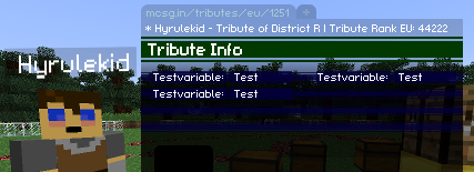
R = Random Number from 1-X
NOT FINISHED YET!
Colors and stuff are WIP. While uploading I realizied it's kind of hard to read as it is right now. Have to change the contrast.
R = Random Number from 1-X
- Status
- Not open for further replies.
