Pixelatorx2
Platinum
- Joined
- Oct 2, 2012
- Messages
- 2,956
- Reaction score
- 2,625
Just a preface: This is suuuper low priority, and I don't expect it to be dealt with for a while. These are just ramblings as someone who has done web development before, as well as someone who has taken web design courses.
I'm sorry if this is going to be a little blunt, and I understand the website is under construction, but I feel really passionate about this topic.
Lets start with, well, the start.
The Homepage
Now, a good homepage accomplishes a bunch of things. It's a first impression for the new users. It connects people to the rest of the site. It, by default, has the most traffic of the entire web page. It is then the most important page of the website.
Back to MCGamer -- the main page just isn't good.
There are two main 'people' who come to the website. People who haven't played MCGamer, and people who have.
Now, I don't know the SEO statistics and how many brand new people the site gets, but I'd bet that this number is significantly lower than the people who come from ingame. In fact, right now, I'd argue it's nearly zero. Most people find out about new Minecraft servers through word of mouth, YouTubers, or Streamers.
First, lets acknowledge what the website is used for in the first place. The forums and the leaderboards. That's the meat and potatoes of this site. Most people are here to use one of the two, and frankly, it's a bit silly that the website doesn't make any reference to either of them.
Getting into what exactly I'd change.
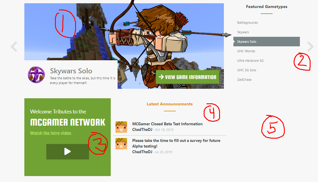
1. Other than this gallery being super buggy, images not loading at the same time, making the page flash, I don't see its purpose. If our users didn't know what these games were, wouldn't they check it out on the server? This takes up the first and foremost slot on the page, but MCGamer hasn't even been introduced. Where is the "Home of the Original Survival Games"? Not to mention most of the gamemodes no longer exist, but they're not the primary purpose of the server. MCGamer has, and always will be, a survival games server. Play to your strengths.
2. These arrows are outside of the website's main container. Why? Just looks bad.
3. If you're welcoming new users this far down the page, why include the games menu? If you are trying to use this page for new users, welcome them at the top. If you aren't then why include any of the games information? They know the server already.
4. Latest announcements should be the primary focus of this page. It's what most people come here for anyway. (that and the leaderboards)
5. About 1/6th of the homepage is just blank whitespace. Jeez.
Here's kind of what I'd change it to.
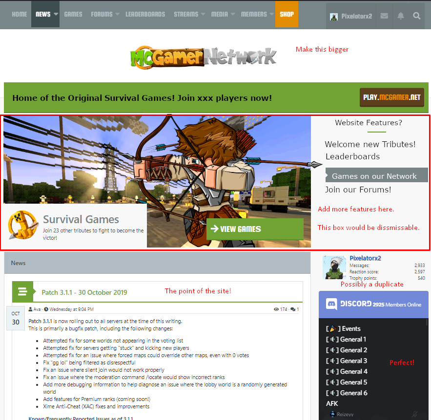
All the same information is available, with a more efficient use of space.
The Header
Switching gears to the header, we have to discuss it's main issue. It's far too thick. With the changes to the main page, the 'news' tab will become obsolete. This should free up enough space to allow for either:
Here's kind of what I mean.
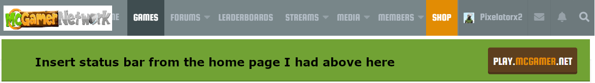
Unfortunately I can't play with the height and font sizes, so I just kind of cut off the 'home' option, but you get the idea.
The Footer
The footer is just broken. I don't think this needs much explaining, but yeah. It's broken.
The Little Details
Now for a couple small issues and gripes.

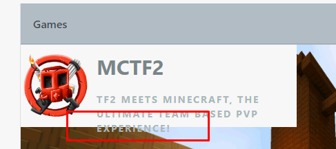
For the sake of brevity, this above issues also happens with: Classic, Quarter Quell, Hungry Games, Party Time, Survival Bingo, SG Solo, Skywars, Skywars Solo, UHC SG, UHC SG Solo.
These are all the issues I could find in my brief hunt. I'd also like to mention this thread as a great idea as well.
I'd love to discuss this further if anyone has any questions or comments.
Thanks for reading!
I'm sorry if this is going to be a little blunt, and I understand the website is under construction, but I feel really passionate about this topic.
Lets start with, well, the start.
The Homepage
Now, a good homepage accomplishes a bunch of things. It's a first impression for the new users. It connects people to the rest of the site. It, by default, has the most traffic of the entire web page. It is then the most important page of the website.
Back to MCGamer -- the main page just isn't good.
There are two main 'people' who come to the website. People who haven't played MCGamer, and people who have.
Now, I don't know the SEO statistics and how many brand new people the site gets, but I'd bet that this number is significantly lower than the people who come from ingame. In fact, right now, I'd argue it's nearly zero. Most people find out about new Minecraft servers through word of mouth, YouTubers, or Streamers.
First, lets acknowledge what the website is used for in the first place. The forums and the leaderboards. That's the meat and potatoes of this site. Most people are here to use one of the two, and frankly, it's a bit silly that the website doesn't make any reference to either of them.
Getting into what exactly I'd change.
1. Other than this gallery being super buggy, images not loading at the same time, making the page flash, I don't see its purpose. If our users didn't know what these games were, wouldn't they check it out on the server? This takes up the first and foremost slot on the page, but MCGamer hasn't even been introduced. Where is the "Home of the Original Survival Games"? Not to mention most of the gamemodes no longer exist, but they're not the primary purpose of the server. MCGamer has, and always will be, a survival games server. Play to your strengths.
2. These arrows are outside of the website's main container. Why? Just looks bad.
3. If you're welcoming new users this far down the page, why include the games menu? If you are trying to use this page for new users, welcome them at the top. If you aren't then why include any of the games information? They know the server already.
4. Latest announcements should be the primary focus of this page. It's what most people come here for anyway. (that and the leaderboards)
5. About 1/6th of the homepage is just blank whitespace. Jeez.
Here's kind of what I'd change it to.
All the same information is available, with a more efficient use of space.
- "Welcome tributes!" would have the welcome video, as well as text with it.
- Leaderboards can link them directly there, as well as talk about features.
- Games on our Network can link to the games page, as well as give some screenshots / cool images of various game types as a teaser
- Join our forums / Signup would link them to the signup page.
- We have a link to the discord!
- The news is here!
The Header
Switching gears to the header, we have to discuss it's main issue. It's far too thick. With the changes to the main page, the 'news' tab will become obsolete. This should free up enough space to allow for either:
- The main logo inside the header. Don't shrink it too much, but capitalize on the gained space from getting rid of its dedicated section by increasing the height (not too much) This way, the main logo can fit inside.
- Keep the logo where it is, but remove the green status bar from every page. If the status should be on every page, it can be made into a box on the right hand side of the page instead.
Here's kind of what I mean.
Unfortunately I can't play with the height and font sizes, so I just kind of cut off the 'home' option, but you get the idea.
The Footer
The footer is just broken. I don't think this needs much explaining, but yeah. It's broken.
The Little Details
Now for a couple small issues and gripes.
For the sake of brevity, this above issues also happens with: Classic, Quarter Quell, Hungry Games, Party Time, Survival Bingo, SG Solo, Skywars, Skywars Solo, UHC SG, UHC SG Solo.
These are all the issues I could find in my brief hunt. I'd also like to mention this thread as a great idea as well.
I'd love to discuss this further if anyone has any questions or comments.
Thanks for reading!