SuperxAndrew
District 13
- Joined
- May 24, 2012
- Messages
- 1,318
- Reaction score
- 2,528
This is basically everything I wanted to say about the map.Joel's Map Review
First off, I'd like to say congratulations to everyone who worked on this map. It is a huge accomplishment to complete a map. Also, I'd like to give my personal thanks to Sean for working with me on getting a download link that functioned properly. With that all aside, lets get into the review. This review will be broken up into four categories: terraforming, builds, theme/execution, and miscellaneous thoughts. Without further ado, lets get started!
Terraforming
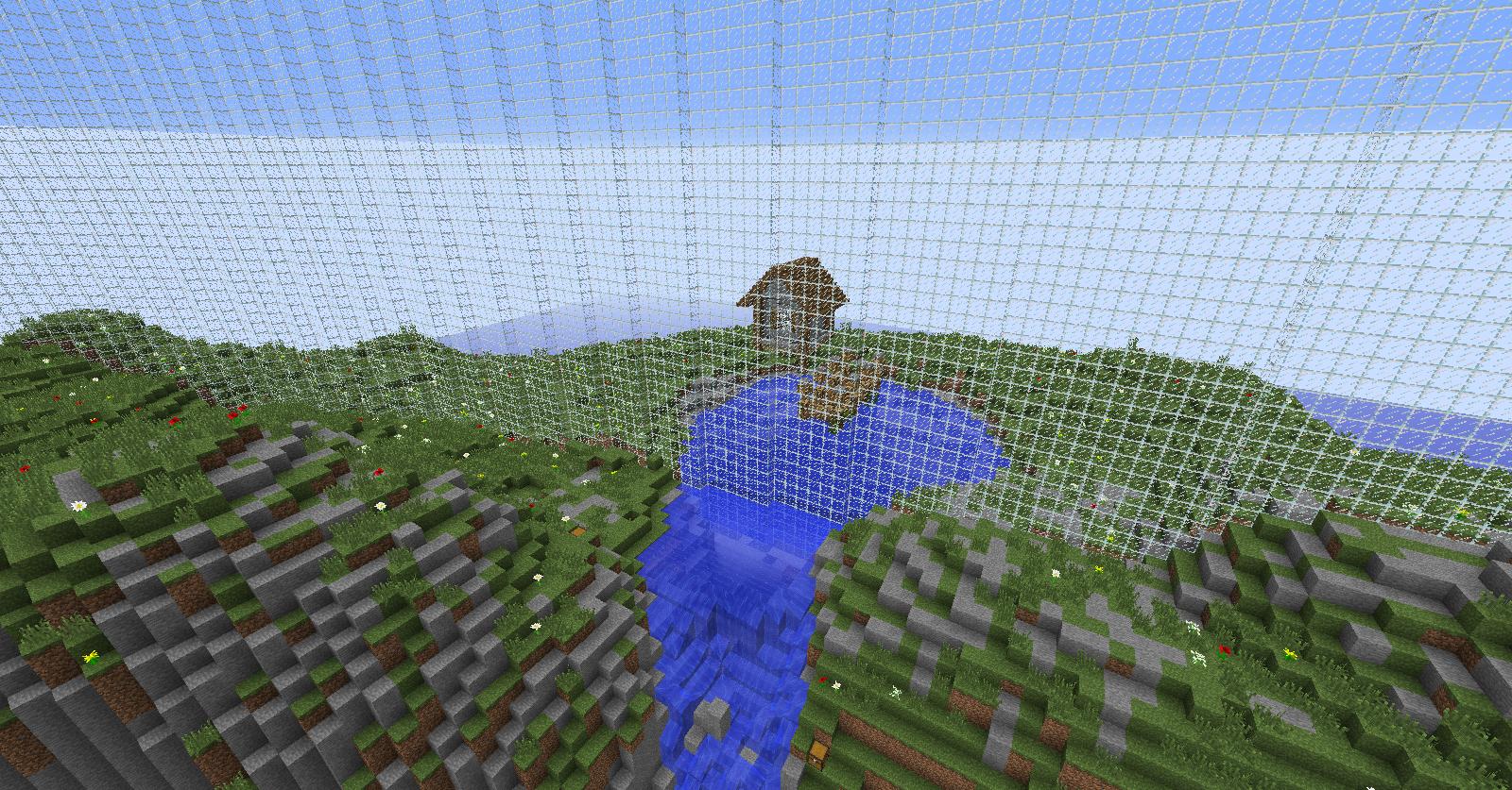
The terrforming on this map is mostly just mountains that create a half circle around corn and the town. Also, breaking up these mountains are a couple of waterfalls. Finally, the one other notable piece of terraforming in this map is a small little cove made to house a boat. As you can see by these screenshots, the terraforming present on this map isn't the most creative, (we've all seen large perimeter mountains, waterfalls, and coves in maps before), but is done well nonetheless. Aside from the odd indentation in a mountain or random block, the perimeter hills of the map are solidly done. The first waterfall is also good, but I personally think the waterfall in my second screenshot could've been a bit better. I think the river that the waterfall comes from could be made longer to give it a more natural feel, and the rocks sticking out in the waterfall could be more jagged and rock-like instead of just being random how they are now (this is the waterfall I'm talking about). Aside from this one waterfall though, I find the terraforming to be well executed despite its simplicity.
Builds
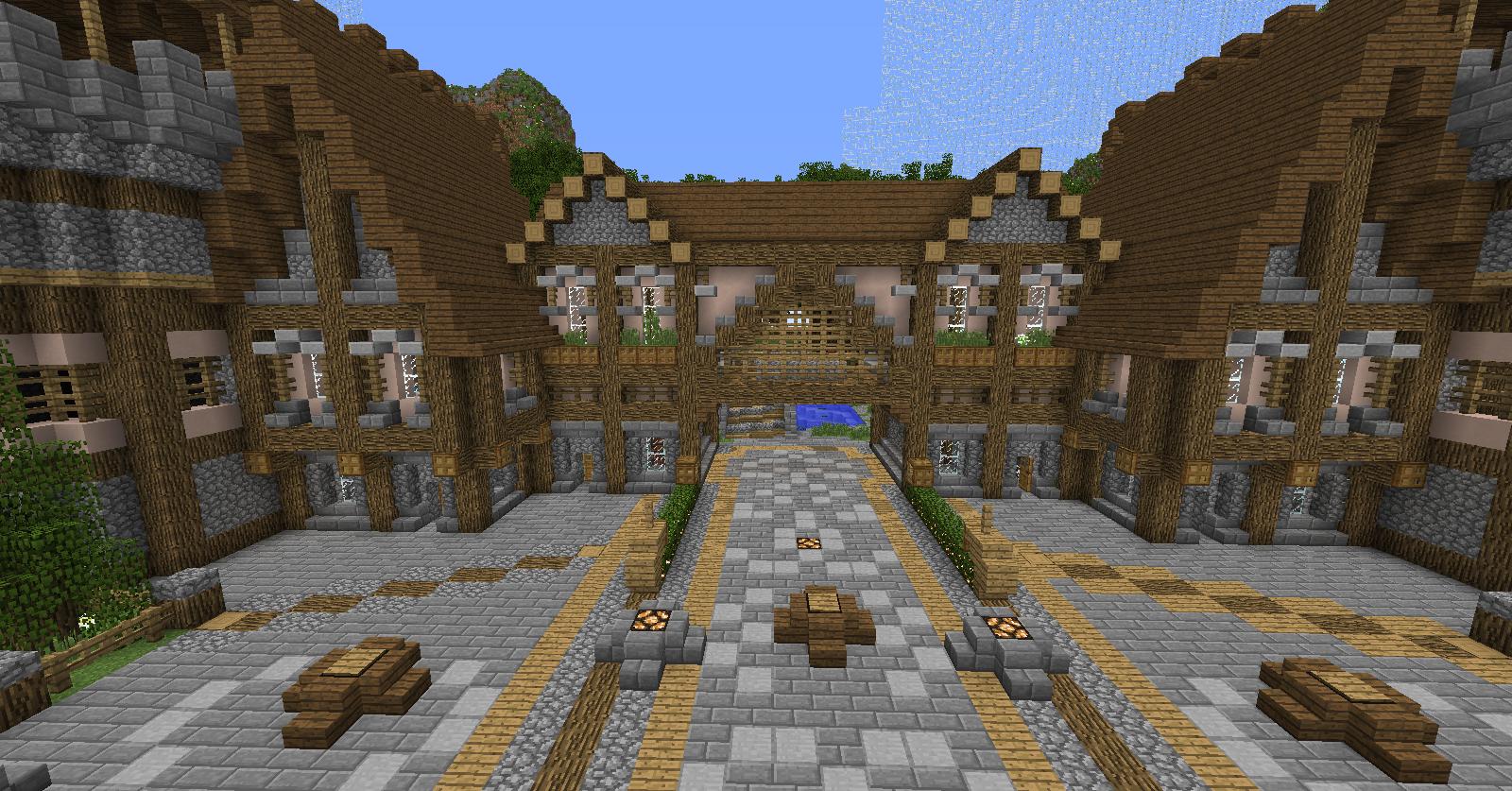
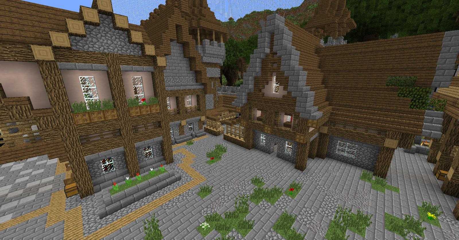
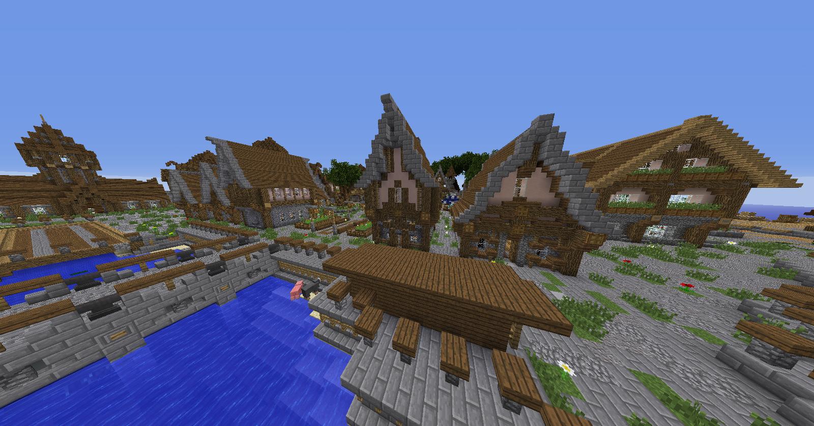
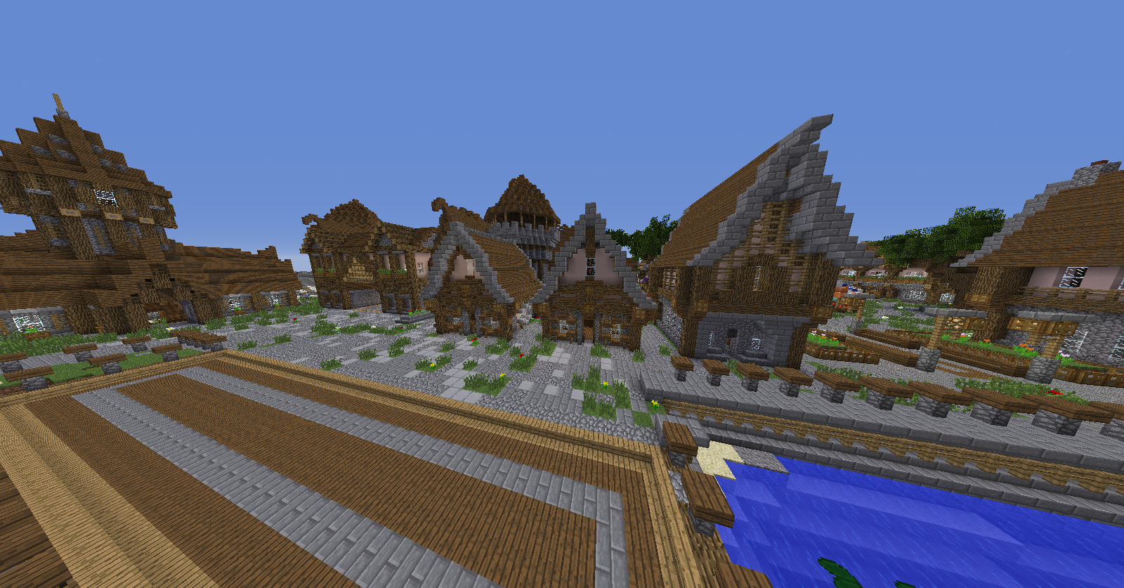
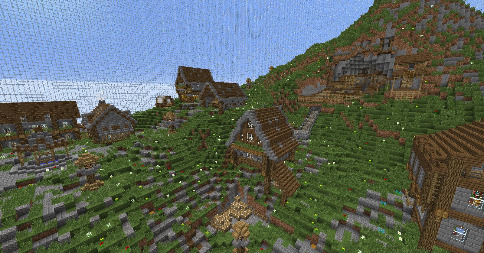
The builds on this map are all centered around one main city. Unfortunately, I found the houses and structures in this city to be lacking quite a bit of detail and depth. As you can see here, some of these houses are practically flat and have ugly large walls of pure cobblestone. While none of these houses I'd consider "bad", I believe they could be improved greatly by adding depth and detail similar to the detail in this house (easily my favorite building in the city). On top of these lackluster exteriors, some of the interiors were also quite empty and basic. Finally, why can't you enter this house, did you just not notice or were you too lazy to do an interior? Overall, the city isn't badly built it just drastically lacks the detail that would take this map to the next level.
Outside of the main city there are quite a few other builds. First off, there are two boats outside of the village (I LOVE the sails and rigging on the big one, but both of their hulls could stand some more detail). Inland from the boats there is a dark forest with some tucked away builds. I personally like the forest and the mysterious vibes it gives off - which was helped along by the solid custom trees that made it up. Also, there is a village farther up in the hills that sadly suffered some from the same lack of detail that the main city did. Besides that, there are some outposts in the mountains and these two things (which I actually liked quite a bit). Overall, the builds are all decent but some have a lack of detail that really hold this map back.
Theme/Execution
Plain and simple, this is not the most "out-there" theme ever. With the addition of Dracarys, mcsg now has at least three medieval maps. To be quite honest, the fact that this is another medieval map probably lowers its chances of getting added. But besides that, I think this map does a solid job of creating the atmosphere of a medieval harbor town. The outposts and tall ships do make this map seem like it is from another time. So even though this map is not the most original, I think it does a solid job of representing a medieval atmosphere well.
Miscellaneous Thoughts
-I actually really liked the tiering on this map. Most maps nowadays add an abundance of tier twos because, well, they can. Fortunately, I did not see a ridiculous amount of tier twos on this map.
-There is nothing outside of the dome. No builds, no mountains, no bonemeal even. This makes the map seem a lot less detailed and lower quality.
-I found a couple or secrets around the map. I also really like fun stuff to find and explore like this in a map.
-tree horse (new superhero? :0)
Final Thoughts
While this map is well executed, the lackluster builds really hold it back. Nothing is bad about this map, but nothing really popped out at me either. Overall, I'd say this map is just a tad bit better than average.
7/10
The builds lack a lot of basic detail and the theme is nothing we haven't seen before. The best advice I can give is: if you are going to use a theme that has been seen before, your builds have to be over the top. Your builds aren't bad, actually they are quite good, but they aren't over the top. Anyway, good luck to you, and I hope you take the review I quoted into serious consideration, because if you fix the things Joel Maury-Holmes stated, then this map becomes a sight to see.

